1–4/2020
UX/UI
Economia subscription
After we added a paywall to our main product, ihned.cz, we needed to upgrade communication and the way of subscribing to our products.
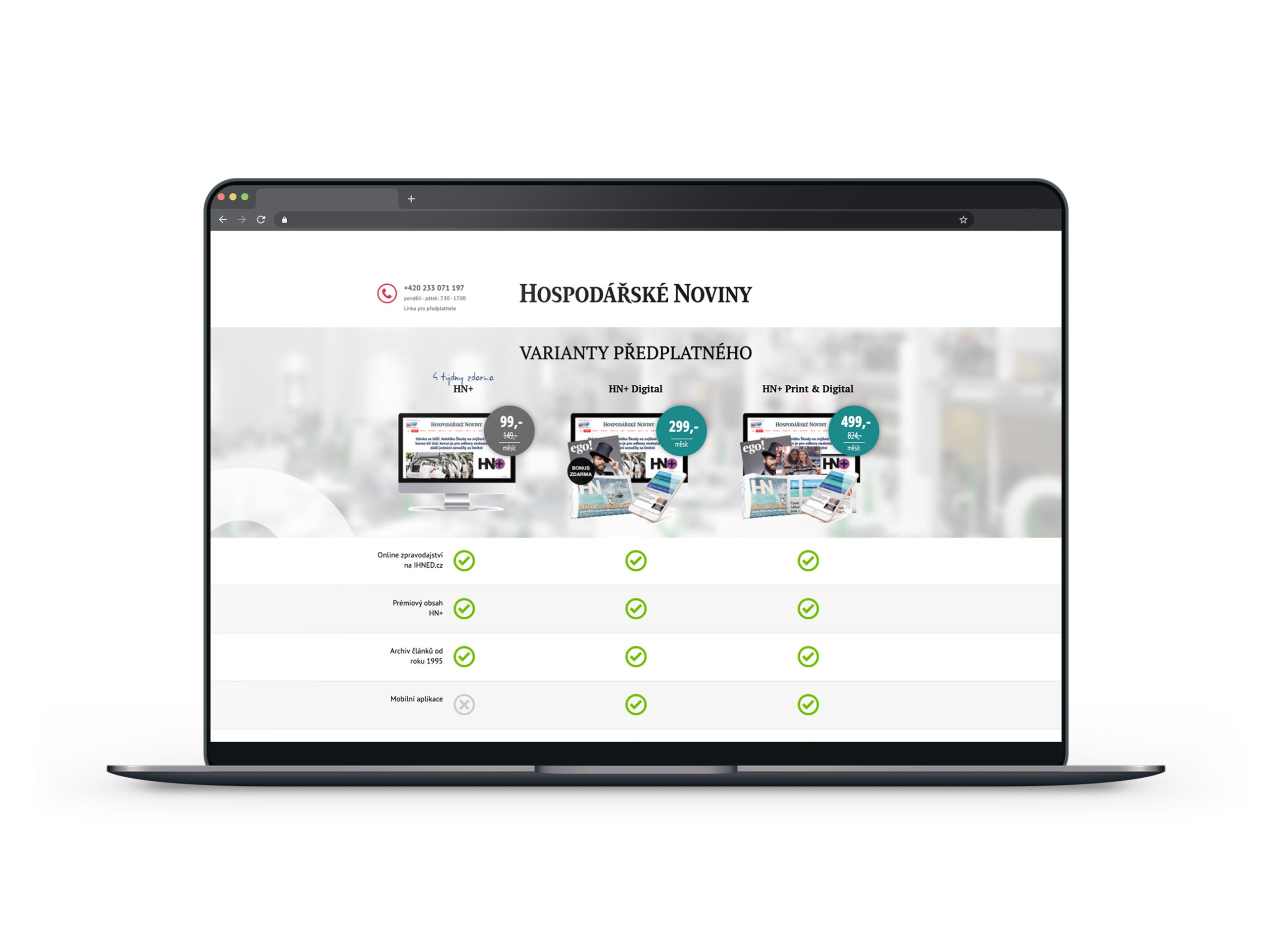
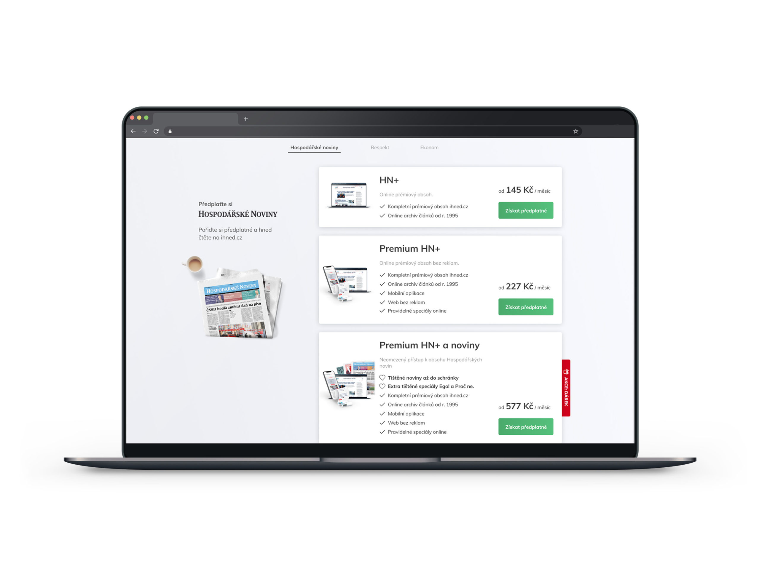
Summary
Everything starts and ends with the subscription system. A heavy and old backend where most of the work is done manually in Microsoft Excel. In the last two years the company has been building a new one and at it will take at least two years to launch.
For now, we must improve the user experience and set a unified visual system across all touchpoints. (website, invoices, emails, letters, marketing, etc.)
1. Economia eshop
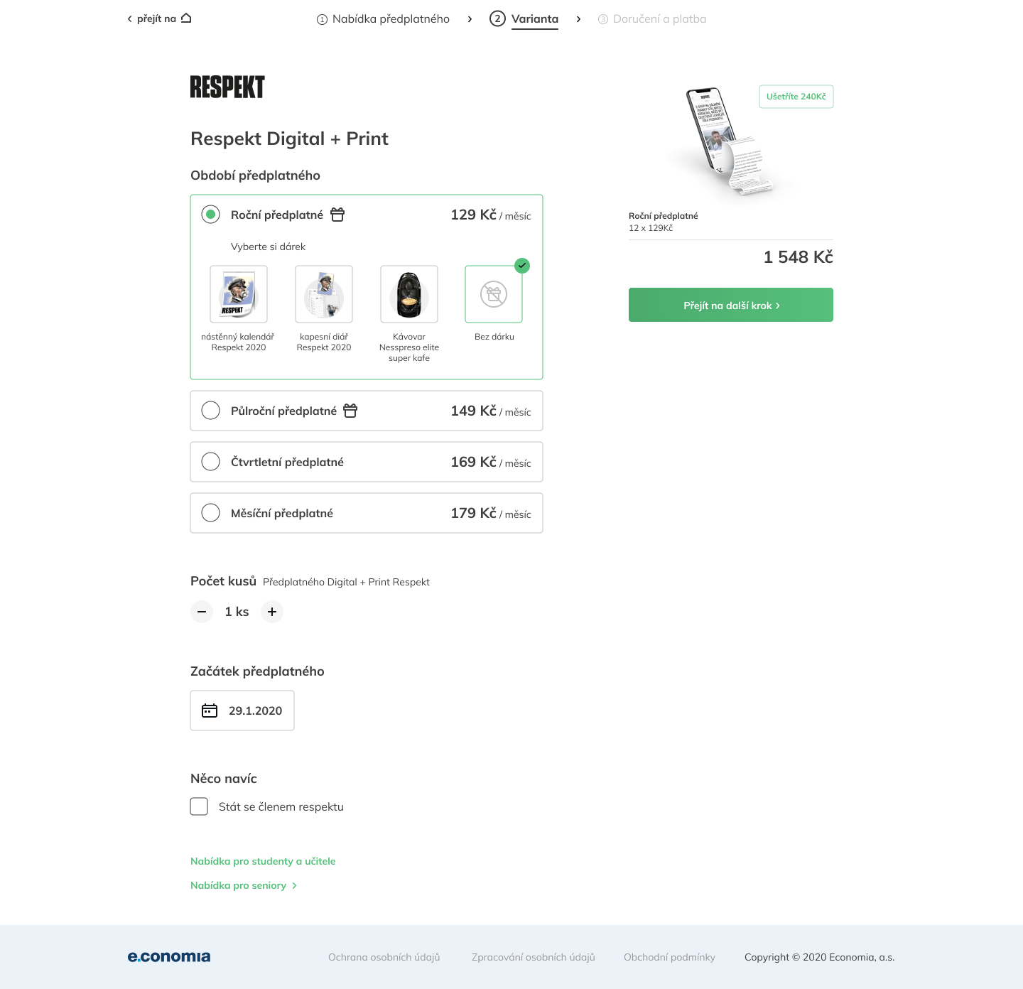
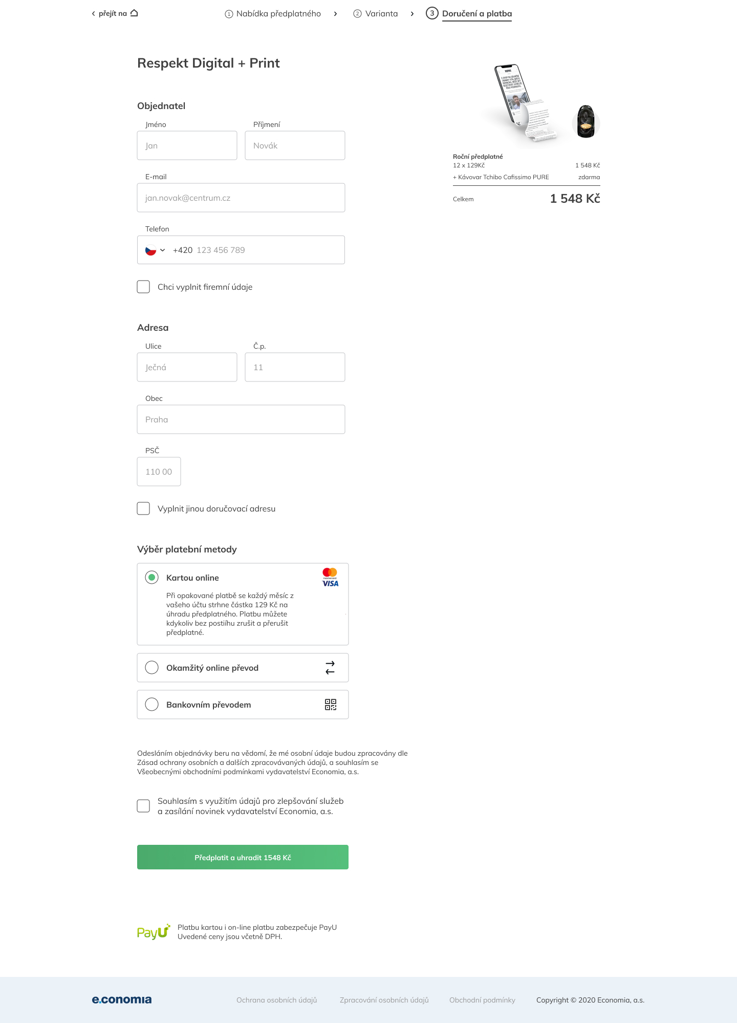
The new e-shop says a lot about the product that you are buying.
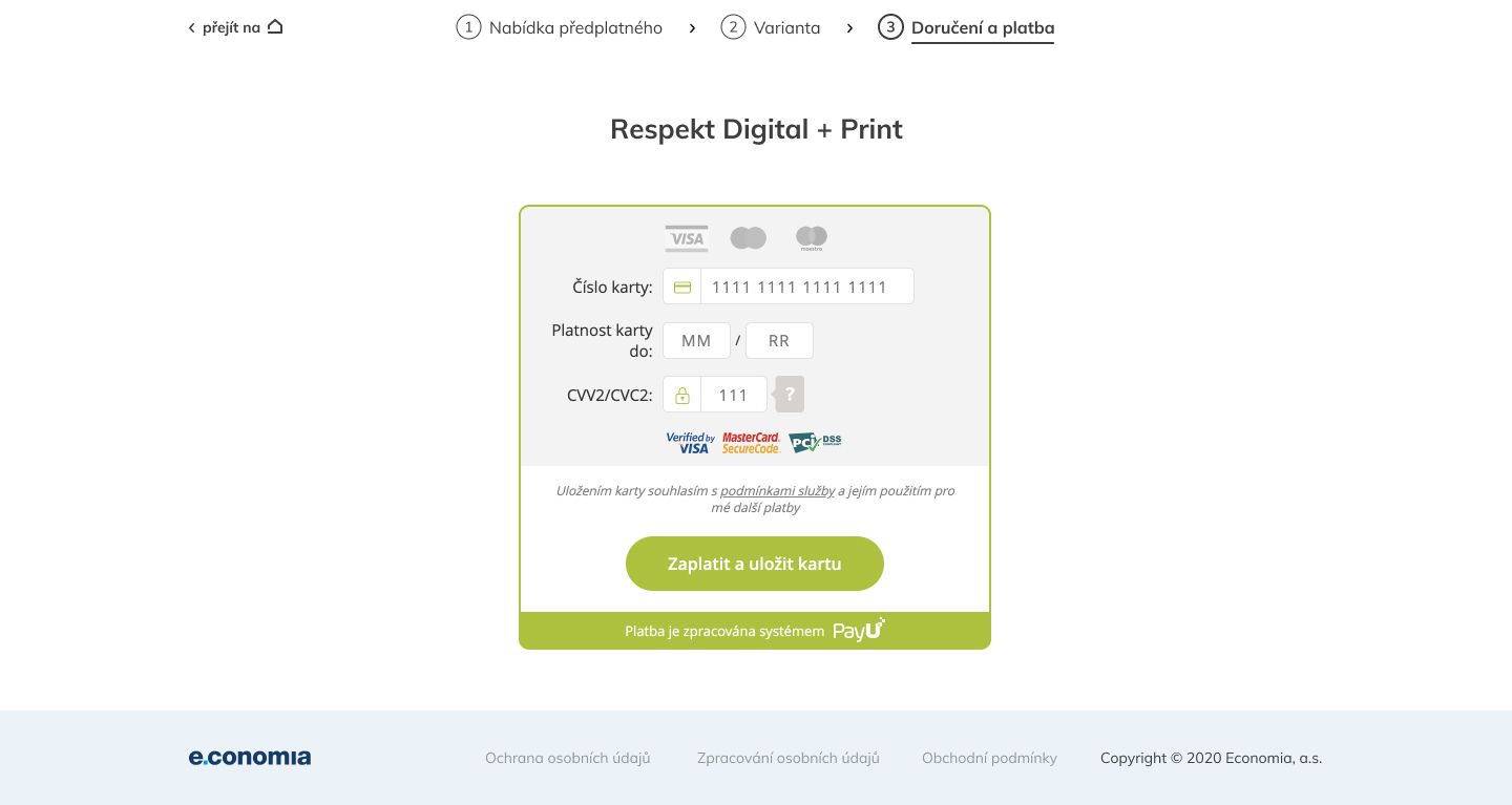
The biggest change was in the shopping process. In the old one everything was in one step. There was a long form where lots of buyers just lost their patience. We separated the shopping cart in 3 steps with improvements in explaining what users are filling out and why.
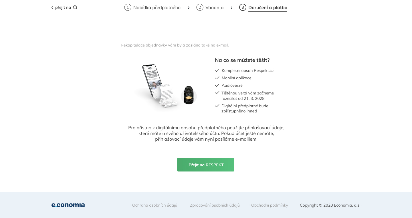
2. Comunication
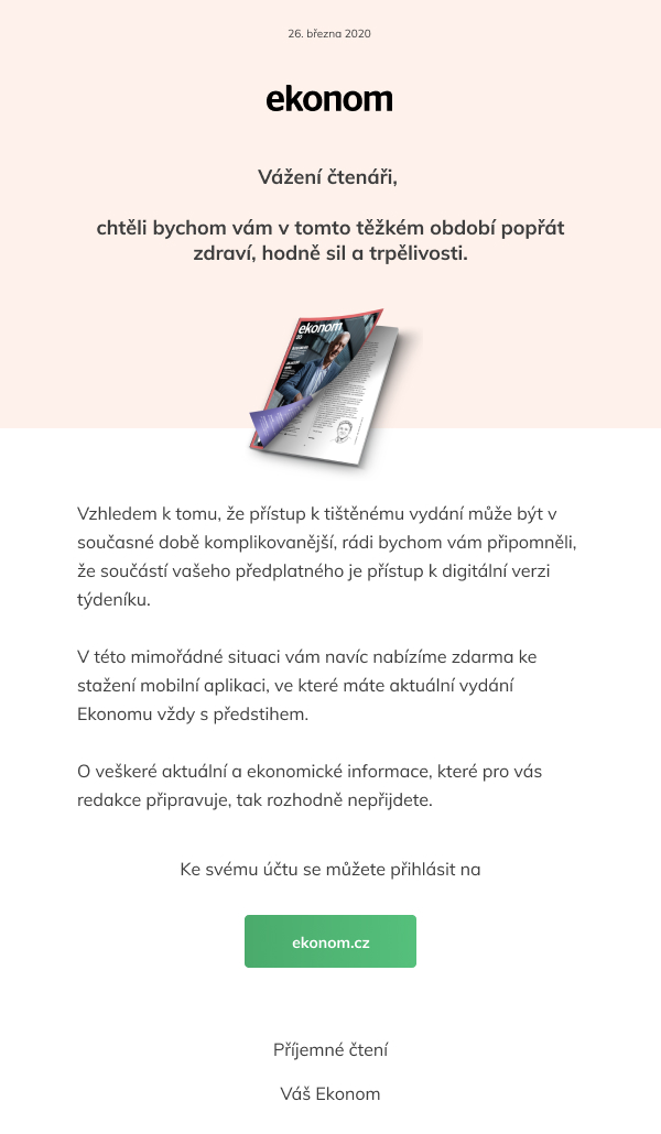
Each product has up to 20 types of emails and letters and 4 types of invoices.

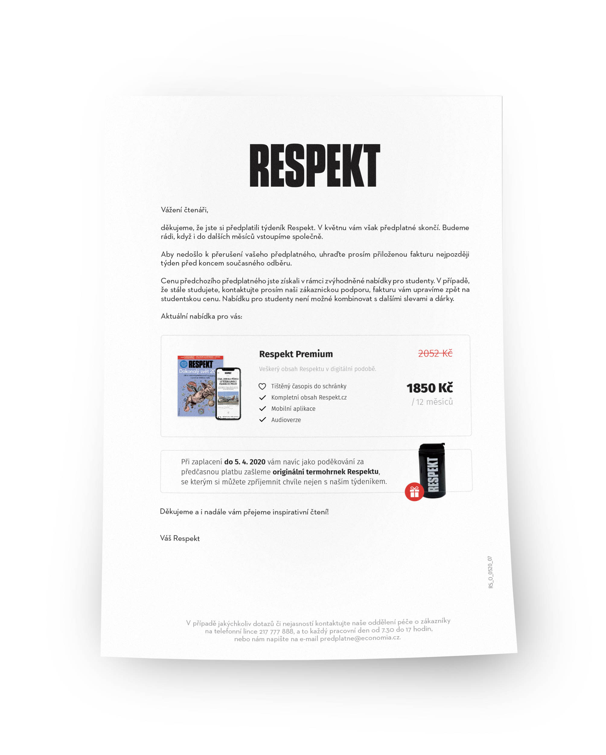
I must admit that the invoice was a challenge for us. We made it understandable and assured it met all legal requirements.

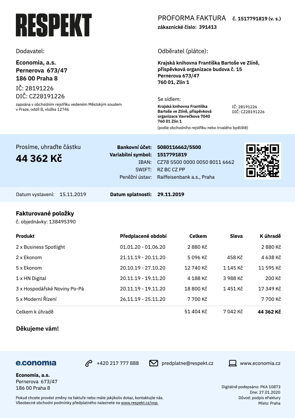
Conversion rate is up 20 % after redesign. And right now, we are running tests to find out what to improve.
The End
Other Works

Respekt appUX/UI redesign

Ekonom magazineRebranding, UX/UI

Studenta magazineCase study, UX/UI

Sewer boysFanzine about Prague undeground
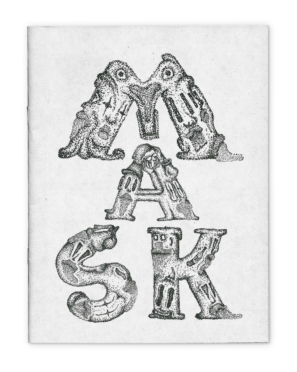
MASKSFanzine about everyday draw

My thingsImprove them
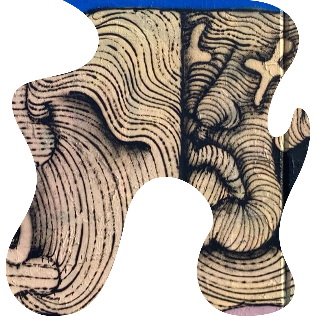
Paintings on the wallillustration